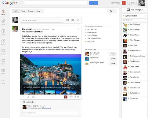
Google+ is less than one year old, but it is already making a major redesign and complete interface change in what appears to be a try to improve the level of user engagement with the site. Google has announced this morning that it is making a its social networking service “more functional and flexible” with a new design.
My first impression from the new design is that Google made a big effort to make the platform much more interactive and dynamic in general so the users could personalize furthermore their social experience and at least from that angle I’m impressed it is running pretty smooth. Let’s go into more specifics.
Dynamic Vertical Navigation Bar
The old horizontal navigation bar has been moved from the upper side of the page and replaced by a new dynamic vertical navigation bar (or “ribbon” as it’s now being called) on the left side of the page which allows buttons customization through a simple drag and drop capabilities.
The user can now personalize his own items on the navigation bar by order and even remove them completely into the “More” icon. When hovering over an icon more related actions appears, for example when hovering over the “Photos” icon the user can choose if to add a new photo or to browse through albums.
I think that the concept of the new navigation bar is actually a pretty good one- Not everybody are using the same apps as others and different users clearly have other priorities. I for once, find the Facebook “static” navigation bar as pretty annoying sometimes.
In any case, you can watch the following short video for more information about the “navigation ribbon”:
The Activity Stream (News Feed)
The most obvious change on the new activity stream is the individual focus each post is receiving. Every post now has its own box which makes the posts much more separate from each other. For every post-box there’s an “activity drawer” at the bottom that collects the users’ comments.
Posts’ shares and +1’s now appears on the bottom right corner of the box hidden (only the number of shares/+1’s showing) and when clicking on it, the post’s activity opens up. Overall, from the short time I played with the activity stream, it is pretty friendly to engage with.
Visual contents like photos or videos are now highlighted more prominently on the activity stream. At the top of the activity stream the user can choose what Circle feed to see (all, friends, family, acquaintances, etc), which can ease the overload for users with many people on their Circles in total.

Hangouts Page
Google+ was always proud of its live video feature Hangouts and now it is giving it a page of its own. The Hangout page basically centered all the user opportunities to connect with others through Hangouts- The open invitations for Hangouts from people on the user’s Circles, fast access for public Hangouts and a rotating billboard on the top of the page that contains more Hangouts information.
For people who likes this feature (personally, I don’t), the Hangout page can surely be a place to find people and places “to hang” with.
Explore Page
Google+ also rolled out a dedicated page to a feature that until now sometimes popped in the users’ activity stream- Explore page, which features all the hottest trending posts on the social network. “Hot posts” are being determined by the level of user engagement with them (comments, shares, +1’s).
Also on this page, trending profiles or hashtags (on the right side of the page). Additionally, in this page the user can adjust the amount of “What’s hot” posts which will appear on the user’s activity stream (4 levels).
This major Google+ overhaul arrives right after a major event of another social network (the acquisition of Instagram by Facebook), however it is completely coincidental. There is simply no way the two events are connected. The real reason for the redesign probably related to the effort Google is making to increase the level of user engagement with the social network after its poor reported stats lately.
I personally do not think that Google+ problem was its platform but the company’s too aggressive attempts to promote the service. But who knows, maybe this change will manage to rebrand the social networking site and attract users to engage with it.
By the way, at the beginning of the blog post Google’s Vic Gundotra is mentioning that “more than 170 million people have upgraded to Google+”. Note that it doesn’t mean that Google+ has 170 million active users, Google has a different way of counting the number of users…