Bing just made its biggest interface upgrade ever (well, for the three years it’s around). Microsoft’s search engine apparently decided that it was about time for doing and it is now going all the way with a new design while trying to crack the big challenge of integrating social into search.
But wait, didn’t Bing made significant design changes last week? Yes, but now it appears that last week’s redesign was just set as a preparation for this latest much more meaningful upgrade. Last week I argued that it can turn out to be Bing’s last chance. Now, it seems even more relevant as Microsoft raising the stakes.
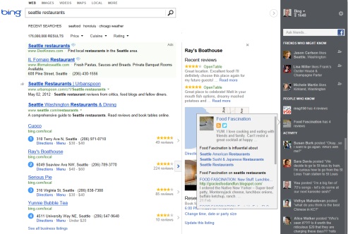
So what is going to be different on the new Bing? The most obvious change is the switch for a three-columns design where the core search results on the left, the Snapshot feature in the middle and a social sidebar on the right. Here’s a screenshot of the new Bing search results page:

Less Social On The Core Search Results
From first glance, it looks like that Bing is taking somewhat the opposite approach from Google when it comes to integrate social elements on the core web results. Essentially, Bing has minimized all social presence on this segment and showing only search algorithmic-driven links. And they are pretty proud about it:
Instead of cluttering your results with social updates, we’re honoring the purity of the core web results making it easier to focus on the links you need to get things done.
This is of course a little bite towards Google’s Search Plus Your World which accused of filling the results page with too many social elements, and you know what? They’re right. I hate Search Plus Your World. In my opinion it completely ruined the search experience and I had to opt it out. Google simply pushed social too far on the search results.
I love the clean design of the new Bing core results. It offers me exactly what I was looking for- Pure results. Nothing less and nothing more. Don’t get me wrong, Google results might be slightly better (although it is pretty debatable these days) but only WITHOUT Search Plus Your World.
But don’t be mistaken thinking that social and personalization aren’t playing any role on Bing’s core results. Bing is still personalizing the results based on the user’s location and based on the user’s prior search history. Additionally, you can find small social icons of friends recommendations and what’s trending on Facebook and Twitter.
So social still exist on Bing’s core results but its very subtle.
Snapshot For More Related Information
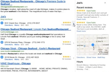
Another interesting new feature that Bing presented is Snapshot. It will sometimes appear on the center column when Bing could provide more related information about specific results. What kind of related information? Reviews, directions, maps, opening hours, images and more. Here’s an example of Snapshot for Joe’s restaurant in Chicago:

It looks pretty impressive and can save a lot of time for searchers. Obviously that sometimes site owners may lose some visitors because now they don’t have to enter the page to find the information they need. To be fair, Google already provides this kind of additional information, sometimes on the results themselves and sometimes on the sidebar.
Most Social Elements On Social Sidebar
Instead of shoving us social elements on the core results, Bing moved most of them into the right sidebar. Before getting into specifics, I have to admit that I liked this general approach. (almost) All social elements are now concentrated on the right side of the page, which I can directly go to find social things or to ignore if I want to.
The social sidebar contains four main elements (most of them would only work if you logged into Bing and Facebook):
- Ask Friends- Allows the searcher to post something to Facebook directly from the search results.
- Friends Who Might Know- Bing will suggest friends that might know more about this topic based on their sharing and liking history.
- People Who Know- People from social networks (not just friends!) that might know about this topic more.
- Activity feed- All the user’s Facebook friends social activity that is taking place from Bing.
Bottom Line: Bing Is Doing Better Social Integration Than Google
If until now it wasn’t clear who’s doing a better/crappy job of integrating social, with this recent upgrade, Bing has managed to find a much better search-social balance than Google. It’s friendly, not intrusive and interactive. You can use it or completely ignore it. In both cases the search experience isn’t changing.
Not only that, but Bing also offers a much more variety of social networks integration. Yes, even with Google+! While Google’s approach that social should be inside the core results, Bing’s approach (probably after learning it’s not working) is to offer clean search results while offering social just as an additional layer.
Sorry Google, but Bing just made your Search Plus Your World fiasco look even more ridiculous.
