 It’s amazing how in less than 24 hours, one of the most important aspects of the blogosphere has gone through some serious twists. Commenting. If you didn’t know that, those little discussion features at the bottom of posts are apparently quite a significant element for any blog which takes the web discussion seriously.
In less than a day after Facebook presented its own official plugin for WordPress blogs which contains among other features its Comments service, another big commenting platform player has some news. In a fabulous timing, Disqus introduces its next generation blog commenting platform, Disqus 2012.
It shouldn’t come as a surprise to anyone that the main apparent goal of the new upgraded Disqus comment system is to make it more social. I guess that when competing against 900+ million users monster which is obviously a powerful source of traffic, Disqus realized that without a social upgrade it’s on the highway to the startup graveyard.

Disqus probably also knows that in order to preserve its giant community of 300 million active users it has to present some alluring new features for both website publishers and for the commenters. Here are some of the new meaningful features on Disqus 2012:
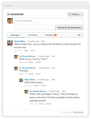
- Cleaner Real-Time Interface- The new service design blended much more naturally within sites and it is far less distracting than before. Additionally, it is being updated in real-time and there’s no need to refresh the page to find out what’s new on the discussion.
- Voting System- Users can like or dislike comments by using up or down arrows. The new scoring system suppose to surface the best comments and to demote low-quality comments. On Facebook Comments by the way, there isn’t any negative voting option.
- Social Sharing- When hovering over the “Share” text on each comment, three icons appears: One for Twitter sharing, one for Facebook sharing and one for permalink for the specific comment.
- Community Tab- Shows the top discussions from other posts on the site. Potentially a feature that publisher would like as it could keep visitors on the site for longer times.
- My Disqus Tab- Shows all the recent personal notifications and activities of the user. Could appeal for both users that would like to manage their Disqus discussions wherever they are and for publishers to keep users on the site.
- Reactions- Disqus will collect all the Tweets about the page and display them. I actually didn’t like this feature as it shows too many useless Tweets overwhelmingly.
- Mentions- By using the familiar social @mention, users would find it easier to communicate with each other.
Disqus 2012 is certainly an upgrade compared to the previous version and the company is stating that it is just the beginning. I can’t help to wonder though, if it will be enough in the long run to compete against comment systems of social networks such as Facebook Comments or the rumored Google+ commenting platform.