After many rumors and assumptions about major changes (including name change), Blogger, the blogging platform of Google, introduced new design and interface for its admin dashboard. Will it be a sufficient answer to its bitter rival WordPress who’s taking over the world?
Google is developing the look and interface of many of its products and now its Blogger turn for redesign. After few years without any changes and updates, which honestly left it behind the constant improvements and progression of WordPress over the years, we can finally say that Blogger become much better.

What’s New?
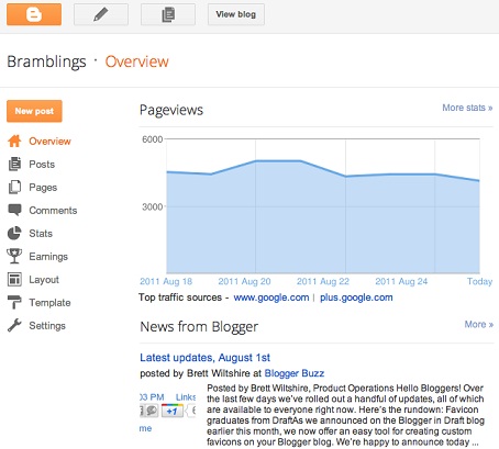
The new interface of Blogger provides a cleaner look and much more easier comfort editing and customizing experience:
– New fixed top bar has been added, so you could create new post anywhere you are on the dashboard.
– The navigation bar has been improved tremendously and its now much more convenient and friendly.
– There is a new analytic stats section for better tracking and monitoring your site’s traffic.
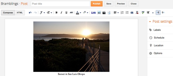
– Improved wider post editor (see photo below).
Google additionally stated that they will work furthermore to improve Blogger in the future and this is just the first wave of updates. You can also send your own feedback easily, with a “Send Feedback” link from the top fixed bar. To access the new interface simply click on the new interface button at the top of the dashboard.

Competition To WordPress?
I can’t say that the new improvements are changing the whole equation- WordPress platform is still better. It offer much more customize possibilities and efficient plugins. However, this is certainly a good move for Blogger and if it will continue improving and evolve on a regular basis, it will be a closer contest.