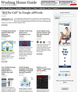
If you are one of the regular visitors here in WorkingHomeGuide.com, you probably noticed that i made some significant design changes over the last couple of weeks and this is why i didn’t published the regular amount of posts (time, time, time). But now, i can officially introduce you to the new WorkingHomeGuide.com design!

The new design is intends to serve two goals:
1. More appealing and offer cleaner look.
2. Put the content in the center.
In order to create the better look i searched for a theme that is relatively simple however good-looking and easy to browse. After long hours of searching, i finally encountered my chosen theme in the site Themes by bavotasan.com. It was love at first sight and i knew it would successfully serve my two goals perfectly.
The theme has a basic magazine style, which puts the content in the middle as i wanted, and it is very easy to customize. Visitors can now browse through the site and discover the best articles, guides, news and resources that suits them with a great surfing experience.
The transition wasn’t easy and included serious site’s infrastructure updates (URL changes) but i am sure that now i can offer you the best work from home information in the best possible way for your convenience! If you like it please recommend us to others!
WorkingHomeGuide.com founder, Omri Shabat.