 Last week, Google rolled out a new search algorithm called “Page Layout” that is designated to demote (penalize) websites with too much ads above-the-fold. The announcement left the webmaster community a little (a lot?) confused about the exact definitions of “too much ads” and “above-the-fold”.
Today, slightly a week after the initial launch, I’ll try to analyze and explain the Page Layout algorithm- How the algorithm is deciding that there are too much ads, where is it exactly above-the-fold and what can be the algorithm’s (negative) effect on a website.
It’s All About The “Real Estate”
One of Google’s senior search engineers (and the official “spam cop”), Matt Cutts, has provided some deeper insights about how the Page Layout algorithm is working, in a Google+ Hangout during his visit in India this week (currently the video isn’t available, when it will be i will post it).
Basically, what Matt has explained was that the algorithm is targeting websites with lots of ads above-the-fold based on SIZE and not AMOUNT. Meaning that a site can be impacted (demoted) by the algorithm even if it has only one ad above-the-fold, if it is big enough!
On the contrary, a website can have 20 ads above-the-fold and still not be affected if the ads are in relatively small space. It is about “real-estate”- If the ads overall space above-the-fold is making the user to scroll down the page regardless to the number of ads, there’s a good chance the site will be affected by the algorithm.
Page Layout Algorithm Losers Examples
The best way to examine this issue furthermore is by real examples of affected websites. But how can we know what websites have been negatively affected by this algorithm? Through the search analytics company, Searchmetrics, which has a reputation of measuring effectively websites search visibility (like in the Freshness update winners and losers).
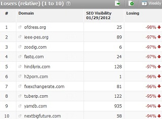
Searchmetrics has posted its biggest SEO visibility losers at the week ending on January 29th (so far) compared to the prior week ending on January 22nd. Because both the Page Layout algorithm and the latest Panda update have been released more or less at the same period, i will try identify the sites affected from the Page Layout and analyze them. Here are the top 10 losers:

I am pretty sure that the first website on the list, that suffered from a big hit in search visibility of no less than 98% (!), is a good example for a site that has been affected by the Page Layout algorithm. Here’s a screenshot image of the site’s homepage:

You can see that almost all of the page is dedicated to one giant promotional ad, which is clearly above-the-fold (and also below). In order to find the real site’s content, the user must scroll down a lot until reaching there. By the way, all of this site’s pages have this above-the-fold ad structure.
Let’s examine another website. The next site’s on the list that i am pretty positive that was affected by the Page Layout algorithm is the one on the 7th place and it also lost a gigantic amount of search visibility, 96%. Here’s a screenshot image of its homepage (again, all the other site’s pages have the same structure):

In this website homepage (and in all of its other pages), we can see two AdSense ad units that taking most of the page upper side space and the user must scroll down beyond it to find the page’s actual content.
I think that these are two good examples of demoted websites that have too much ad space above-the-fold and they are making it very clear what does it mean exactly “too much” for the Page Layout algorithm. We can also see that when the algorithm is acting against a website, it has no mercy at all (96%-98% decline of the total traffic)…