In the first week after beginning to trade publicly (pretty disappointingly so far), it appears that Facebook wants to keep altering and updating its platform as it used to do as a private company. Even though these aren’t significant upgrades, still nice to see a continuity.
The first update relates to a friendly integration of the soon-to-be-launched App Center with the social network’s mobile platform and the second is a new Timeline profile appearance the company spotted to be testing. Let’s go over the recent Facebook updates:
Enhanced Integration Of The App Center Into Mobile
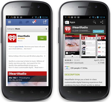
Facebook posted on its Developer Blog details about how the new App Center, which will roll out in the next couple of weeks, would interface with mobile devices. With more than 500 million mobile users and while Facebook sending 160+ million visitors to mobile apps every month, you can bet they wish this integration will be simple as possible.
To execute this simplicity, Facebook is presenting a friendly installation of mobile apps via the App Center from the social network’s iOS/Android app or from the mobile site (m.facebook.com). Installing and setting an app suppose to be a very easy process in a matter of just a few clicks from the App Center.

Another interesting new feature which designated to make the life of mobile users slightly more easy is a “Send to Mobile” button from the app’s page, which sends a push notification the user’s mobile device where he’s logged in. The notification takes the user to the app itself or to its installation page on Apple’s App Store or Google Play.
Testing New Timeline Look
Facebook confirmed to Talking Points Memo it is experimenting with some subtle changes to the user’s Timeline appearance. TPM also captured a screenshot of the new Timeline profile, here’s how it looks side by side next to the current look (current-left, tested-right):

As you can see, on the tested Timeline appearance version, the user’s about info and the name have been moved up in front of the cover image, while the thumbnail images from the user’s tabs below have been replaced by an icon. Additionally, a new “Summary” tab has been added to show the user’s main “Life Events” and the “Likes” tab renamed to “Favorites”.
Note that there isn’t any guarantee that this new tested version will eventually stick and perhaps just parts of it will be implemented (if at all).