 Facebook has location-based features. Google+ has location-based features. Twitter has location-based. Even Instagram has some location-based features. The Foursquare guys knows that they have to go beyond the check-in experience because it might just not be enough to survive on today’s social networking world.
So now, Foursquare is upgrading its mobile app (for iOS and for Android, Blackberry soon) with enhanced and improved features which will encourage users to use it far more than “just” to check-in and try to make it the people’s choice of location discovery engine mobile service.
On this new release (version 5), although the check-in feature remains dominant and essential part of the service’s experience, the app also receives a much more traditional social networking attributes which clearly indicates that Foursquare intends to reinforce the different interactions between people.
While on the prior app’s version “Friends” tab the user could only see the latest check-ins of his/her friends, the new “Friends” tab will now also display photos from the venues and, for the first time, the possibility to like (using a heart icon) and to comment. It is more interactive, more engaging and more social.

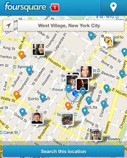
The new upgraded “Explore” tab perhaps may portray best how Foursquare has evolved. Instead of focusing on solely on the user’s ability to search for locations, it is now featuring visually friends’ recommendations, activities and popular venues nearby as the search box is just another option to discover and not the only one.
While the Explore tab will now show recommendations and venues that the user might have not find otherwise, it also became smarter. Time is now also taken as a factor and on the map (see image at the top) it will display if your friends are in the area and where are the places you might want to visit based on your historical check-ins.

The user’s profile tab was also been redesigned nicely and now it looks much more as a, well, profile. The leaderboard feature from the prior version has been removed and now the tab basically consolidates all the user’s information ordered by thumbnails (friends, stats, photos, tips, badges and lists).
As I stated, even with all those changes and the shift towards more traditional social networking characteristics, the check-in feature wasn’t neglected. In fact, it is now probably even more easy-to-use. The check-in button has been relocated from the bottom tabs area to the top right corner of the app and it follows the user anywhere on the app.

Foursquare’s new app surely feels like an improvement and if indeed one of the upgrade goals was to grant more interaction options for the users I would certainly say it achieved that goal successfully. However, we’ll have to wait and see if it will be sufficient to grow beyond the service’s current 20 million users and survive on the super-competitive social networking arena for the long run.