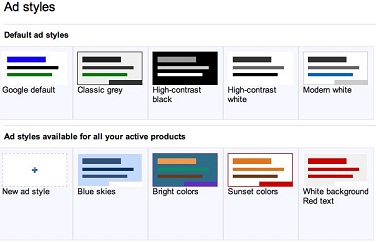
In the last week, Google AdSense presented two changes/updates to its ads: New color palettes for ads (Ad styles) and new design to the ad link units. As AdSense takes a big part of the work at home revenue for many, let’s try to understand better these updates:
Ad Styles – New Color Palettes
AdSense has introduced new customize option for the ads- Ad styles. This is in fact an enhanced function of the ad color, font and corner combination so the publisher would have more already prepared possibilities to save time.
It also provide another time devaluation possibility to apply a certain style on multiple ad units (even on all if needed) at once, instead of editing each one individually. The new ad styles will be available under the “My ads” section.

New Link Units Design
AdSense also introduced new design for the ad link units- Google discovered that in general, 4 links in an horizontal unit perform better than 5 links. Therefore, all horizontal link units will automatically switch to 4 links and all vertical link units will switch automatically to 3 links. You may also notice a bit more spacing between the links.
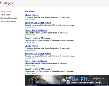
In addition, The ad landing page received a redesign and it will look like this:

It is more of a modern fresh look that will encourage the users to engage more with the links (ads), as AdSense updated the page colors, fonts and banners.
For more information about the ad link units of AdSense you can watch the following video: